Magazine barcodes

Magazine barcodes are a little different to other barcodes because :

  • How do Barcodes for Magazines work?
    The 12-digit barcode on the left is the standard UPC barcode. This 12-digit UPC code identifies the sale of one title by one publisher.
    What differs from one issue of the magazine to another is the barcode on the right. This barcode is referred to as the periodical (bar)code or issue supplemental and identifies the issue of a given year. For example:
    Magazines published quarterly feature issue codes 01, 02, 03, and finally 04.
    The following year, the magazine starts over with 01.
    Monthly magazines require issue codes 01 through 12.
    Weekly magazines require issue codes 01 through 52.
    When scanned at the register of your retailer, your magazine title is identified with your company once your 12-digit UPC code scans. Additionally, the 2-digit supplemental code identifies the particular issue being purchased.

    Therefore when purchasing barcodes for magazines, you only need one UPC barcode to identify your magazine and as many issue supplemental codes as you have issues per year. (Yes, you can re-use the code from this year’s January issue [Supplemental “01”] for next year’s January issue.)

  • Do I really need a Barcode on my Magazine?
    Yes, most stores have electronic point of sale (ePOS) systems that enable them to keep track of their sales and stocks and to reorder magazines by scanning the barcode.

    Most retailers refuse to accept magazines that are not barcoded. In addition, many distributors make use of barcodes in their warehouse systems.

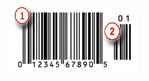
  • How are Barcodes for Magazines different?
    The requirements for a barcode for magazines differ slightly from the standard UPC barcoding for other retail products. The reason for this deviation is that the magazine industry requires the ability to differentiate the various issues of a given year’s magazine. You meet this requirement by using a periodical code in addition to your UPC code.

Research of magazine layout 1

magazine-layout

The layout of this magazine is very good as it is neat and tidy also it is easy to see where everything goes but also it is easy to read as the article is not all mixed up and jumbled like some magazines. The colours used in this magazine is good as it is white with black righting and also there is two black lines on the top of the page and two black lines on the bottom of the line the lines are going horizontally across the page and this is good as it makes the magazine look smart, neat and professional  also this article looks good as the information is broke up by a picture that starts in the bottom right corner and continues up to near the top right corner but it also goes nearly halfway across the page. This is a double page and on the other page that is on the left of the article it has three pictures on the top of the page and underneath them is some text saying “THE MANY FACES OF HERVE CHARLOT” and then under that there is another six pictures in two lines of three this looks very good as it means that you are not overwhelmed by pictures but it also means that by having the text it means that you know what the pictures are and what they are about. Also there is halfway through the article a bit of speech from the interview so all together this is very good and it suits the perpus of being an article about an interview as it is not over the top but it is still interesting while still looking professional.

I have started the design and layout for my magazine

I have started the design of the house style for my magazine and also i have started to decide on the layout of my magazine and where things are going to go in it also i have started to design what my front cover of my magazine is going to look like.

i have decided on a orange outline on the page and a black background the righting is going to be silver and in the font of Lucida Blackletter as this looks good and actual goes nice on my magazine the font size for my titles is going to be 36 as this is not to big and not to small but also because it also makes the righting clear and easy to see and read i have not yet decide on the font size for the article text as i have not done that in the design yet but the font is going to be Lucida Blackletter as this is going to be the constant font theme throughout my magazine, i am going to have two pages that are pictures of doncaster and underneath all the pictures there is an explanation of what the pictures are where they where taken and when they were taken one page is going to be pictures of doncaster in the past and the other page is going to be pictures of doncaster know present day, along with my front cover there is going to be a contents page and an article page with an article about something that is going of in doncaster but also with it linking back to the past and seeing if there was an event like it in the past and if there was when it was and what it was but also what it was for and if it was to celebrate something.

mock up mag

I have been analysing magazine covers

I have been looking at different magazine covers and from looking at them i have deduced that i need to make sure that all the colours go together and do not clash also i have worked out that i need to make sure that i use similar fonts and colours when it comes to the righting the picture on the front cover needs to be large but not so large that it overpowers the whole front cover my idea is that i might put a picture of the old earl of Doncaster and the current earl of Doncaster on the front to link it to it being a magazine about the history of Doncaster and its comparison to the Doncaster of today. down below is a few examples of magazines that i have looked at.

2009_John_van_Wyhe_DarwinvsGod_fig001History Nov Coverimages???????????????imagesimages (1)

I have decided on my title font

I have decided the font that i am going to use in my magazine i am going to use the font Lucida Blackletter the reason for this is because it looks really nice it also looks fancy and it fits in with my theme of having pictures of doncaster in the past and comparing them to know and also because of my theme of historical comparison of doncaster the other good thing with this font is that it looks like it would be used in historical times but it also does not look to old that it will not look to out of place and outdated. I may choice a different font for the other bit’s of the magazine but i have yet to choice them. 

My magazine is going to be aimed at

My magazine is going to be aimed at both males and females as the subject that it is about is not single sex oriented and also the colours that i have picked for my house style and page style is also another reason as it is not just aimed at one sex it is aimed at both and will appeal to both sex’s.

I have decided on the house style of my magazine

I have decided that the house style of my magazine is going to be orange, silver and the pages in it are going to be orange and white with silver righting the reason for this is because it will be eye-catching but also i have had a look at the colours together and they look good together so i know that the colour combination is good together but also depending on how i place and arrange them then it will most likely look very professional but if i do not arrange them right then there is the possibility that it will look sloppy and unprofessional and also as if it was not done with much care or work and it would not be good for the public.

Orange-HD-WallpaperVector-Flower-Black-and-White-HD-Wallpaper14263657-line-silver-metallic-textured-with-rough-pattern

Codes and Conventions of genre in magazines

The codes and conventions of genre in magazine are important to make sure is easily recognised and also so that it is not confused with another genre of magazine. There are many different genres of magazine such as  craft magazines, fashion magazines, gossip magazines, history magazines, teen magazines, since fiction magazines, music magazines, spiritual magazines.


What age group am i aiming at

The age group that i am aiming my magazine at is teenagers and young adults the reason for this is because i think finding out about the history of doncaster and about how it looked in olden times really interesting and i believe that other people my age would enjoy reading about this as it means that they can find out a lot about there home town and also find stuff out like why the continental market comes to doncaster but also it would be good because it would help to describe the reason behind the doncaster’s St Leger festival.

What i am going to do this week

This week i am going to go around doncaster and trying to take pictures of present doncaster as accurately to the pictures that were taken of old doncaster so that i can see and compare and contrast how doncaster has changed over the years.   also i am going to try and get in contact with my older family members so that i can ask them how they felt and found it living in a different doncaster when they were my age and if they think that it is better know or if they found it better when they were my age.